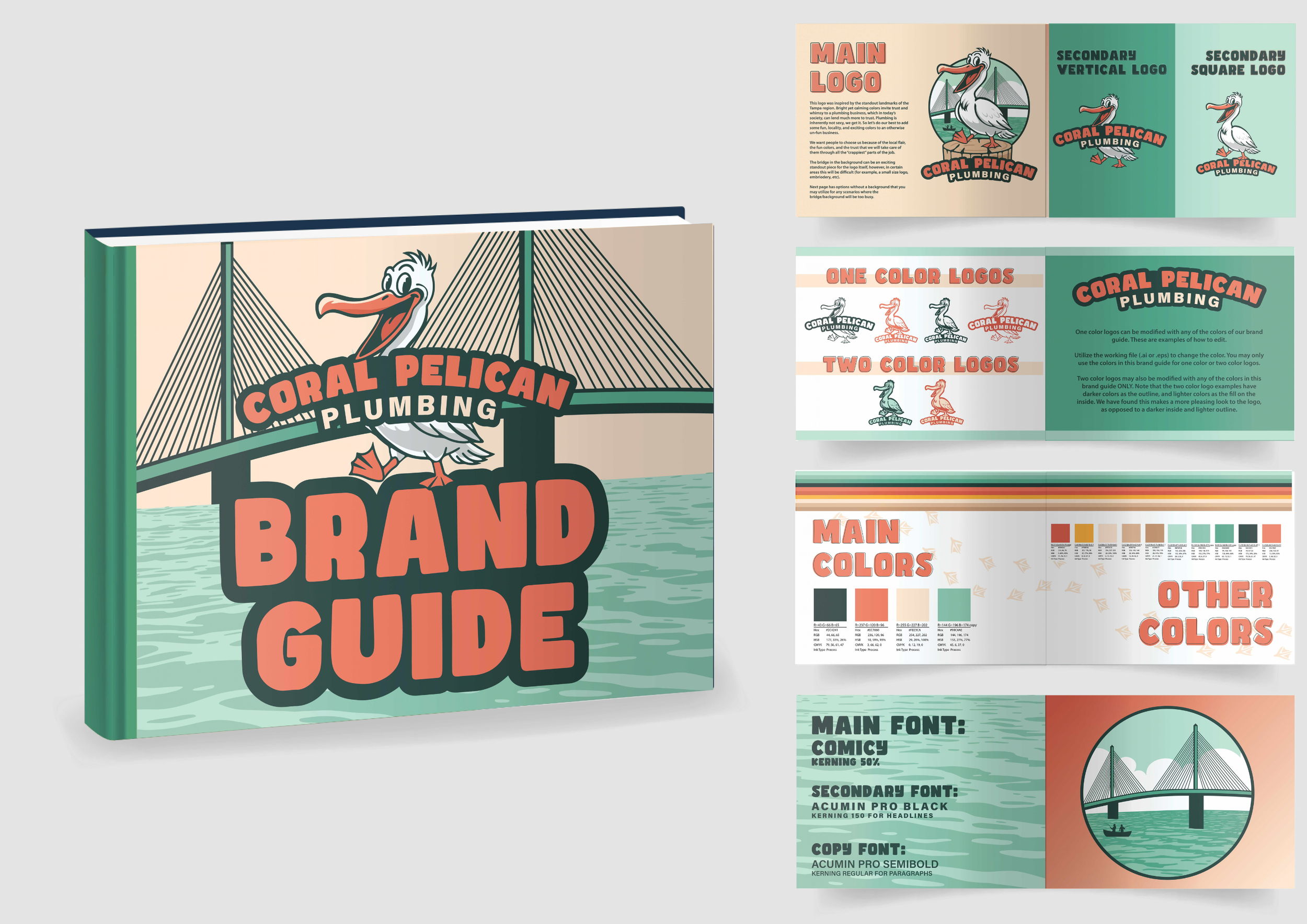
Coral Pelican is a brand in Florida that wanted to have “the most badass trucks on the road” for plumbing.
The owners wanted to tie into the coral colors to the branding, while hitting on some of the coastal elements the owners loved so much. Playing on a pelican with a large, friendly smile, a fun yet readable and recognizable font, and a background of one of the most recognizable bridges in the area was tied together to make the primary logo.
Of course, other versions just have the recognizable font or pelican. We tied in a small nod to the owners who love to fish, and created an entire brand guide to give them a good start. They have people on staff who will continue to develop and expand their branding, but they hired me to give them a good starting point.